
Summer weddings have a naturally romantic energy. We’re talking long golden evenings, fresh florals, destination worthy scenery, and a sense of effortless celebration. But as a wedding planner, I can tell you this - the color palette is what transforms a beautiful summer wedding into an unforgettable, elevated experience.
The right palette influences everything. From your floral design, bridal party attire, tablescapes, lighting, stationery, and even the emotional atmosphere of the day. Summer is the perfect season to embrace color, but elevated weddings are less about using more color and more about using color intentionally.
Here are our favorite sophisticated summer wedding color palettes for couples who want a refined, editorial inspired celebration.
Coastal Blue and Soft Sandy Beaches
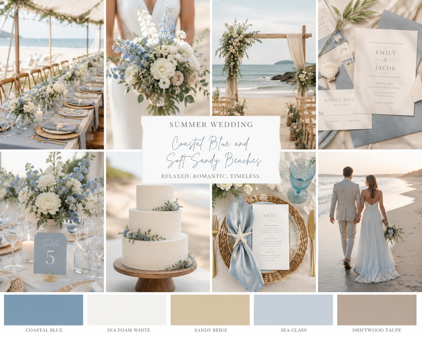
This palette is elegant, timeless, and effortlessly luxurious. Think of the Hamptons. A seaside wedding, lakeside venue, or upscale garden celebration. The combination of blue tones with warm neutrals creates a balance, with sophistication, without feeling overly formal.
It photographs beautifully in natural sunlight. Soft blues reflect the summer skies and neutral tones ground the design. It’s nothing overly saturated and every tone complements the environment naturally.
This palette is for you if you are seeking a:
Coastal Wedding
Yacht Club Celebration
Luxury Tented Wedding
Destination Wedding
Sage Green and Champagne
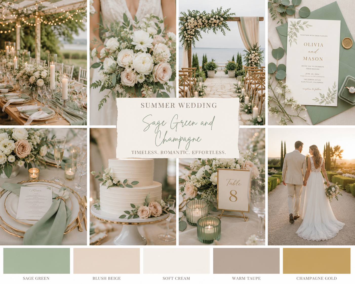
This is a classic color palette for summer. Sage green is modern, but classic. It works with virtually every venue style while still feeling fresh and seasonal. The secret to elevating this palette is with layering textures, instead of piling on the color.
This palette leans into harmony. It flows seamlessly and creates a calm, romantic visual experience.
This palette is for you if you are seeking a:
Garden Wedding
Estate Venue
Vineyard Celebration
European Inspired Wedding
Classic Hotel
Terracotta and Blush
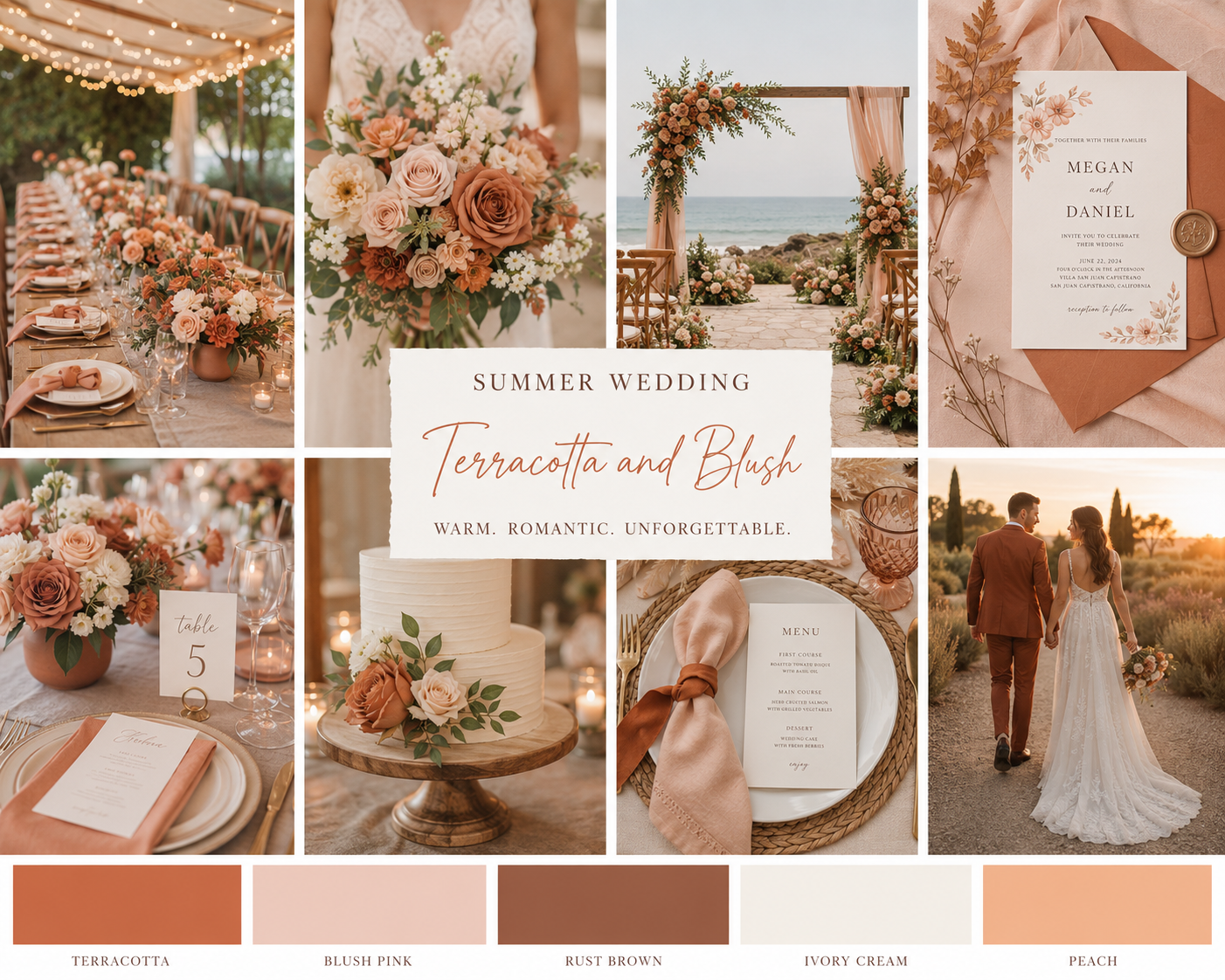
Warm, editorial, and sunset inspired. This palette is for couples who want warmth, without going full boho. It creates a fresh and refined atmosphere, with a touch of Mediterranean vibes. It thrives during golden hour and works well with outdoor summer venues. It creates a stylish, but emotionally warm and inviting affair.
Add in some taper candles to enhance the warm, neutral tones and add some fun florals - such as garden roses, ranunculus, and even fresh fruit (like a peach).
This palette is for you if you are seeking a:
Tuscany Inspired Affair
Outdoor Estate
Desert Venues
Romantic Courtyard Celebrations
Rooftop Event
Emerald and Soft Peach
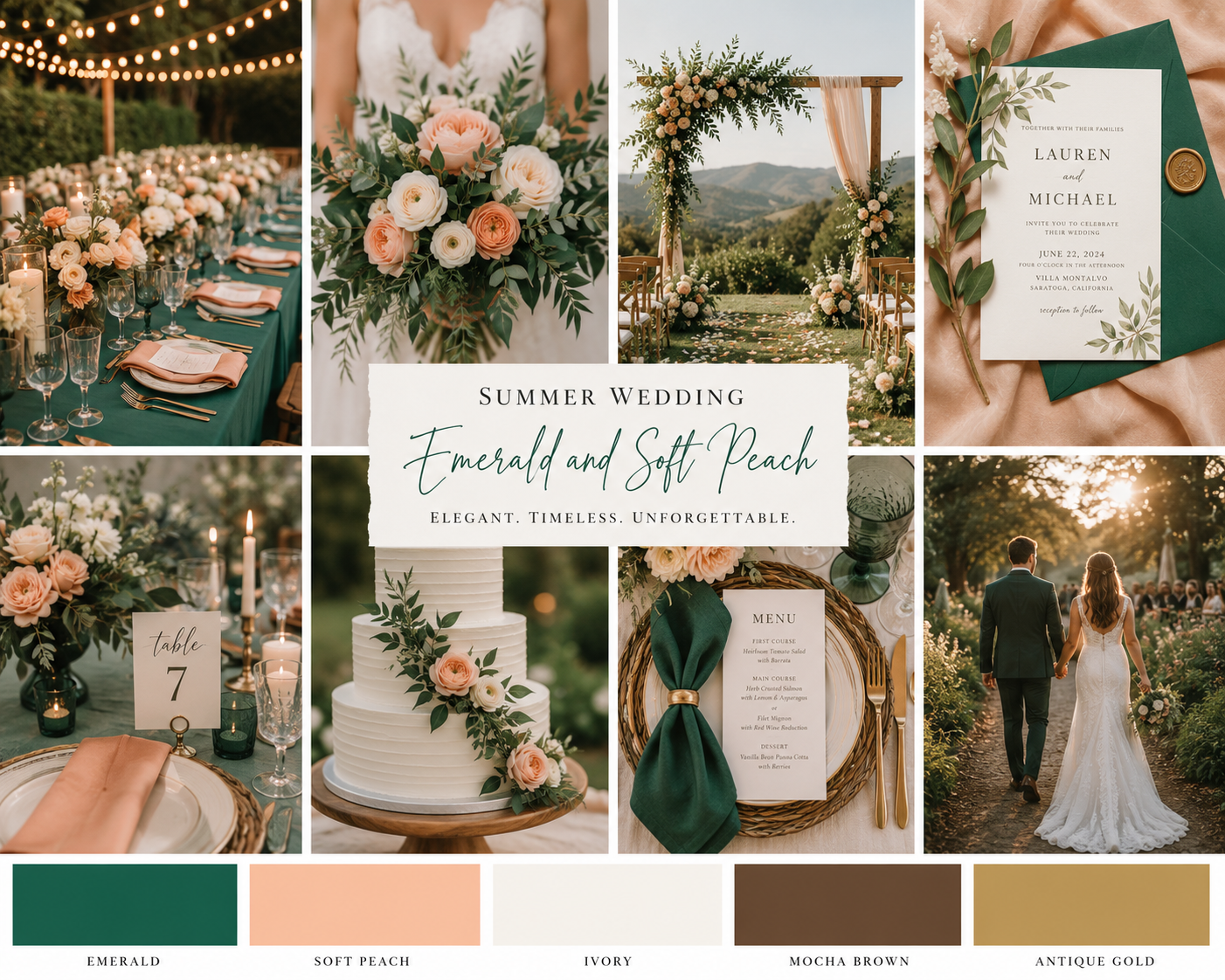
This season is about fresh and bold colors. Emerald green instantly adds a sense of luxury to any wedding design. Pairing it with peach keeps the overall look soft enough for summer, while still feeling striking. It’s a trendy palette, but creates a refined look.
This palette is for you if you are seeking a:
Luxury Hotel Wedding
Garden Estate
Modern Black Tie Wedding
Destination Resort
What Makes a Bold Palette Feel Elevated?
Bold does not mean chaotic. The most luxurious modern weddings use color strategically. Focus on the contrast. Create just a little bit of tension between colors, like dark and soft, warm and cool, or vibrant and neutral.
Even the most spectacular weddings need breathing room.
Lean heavily on florals, architectural candles, minimal stationary, statement linens, and color blocking.
Not every detail needs to match perfectly. Elevated weddings layer tones organically instead of repeating the exact same color everywhere.
Modern summer wedding palettes are becoming richer, bolder, and far more design driven than in previous years. Couples are embracing color as part of the storytelling experience, creating weddings that feel immersive, stylish, and unforgettable.
The key is balance. Think of bold color paired with thoughtful styling, layered textures, and intentional restraint. When done well, a strong palette doesn’t feel overwhelming, it feels like art.
